ZipRecruiter Website Refresh
Design exploration focused on improving clarity, hierarchy, and motion across ZipRecruiter’s core web experiences. The work explored how layout, content structure, and lightweight motion could better support comprehension and conversion for both employers and job seekers.
Scope and role
I led design and motion explorations across key entry points on the website, working closely with product designers, marketing partners, and stakeholders. The project ran in parallel with a broader brand initiative and focused on experience-level improvements rather than a full rebrand.
Page 1: Employer Experience
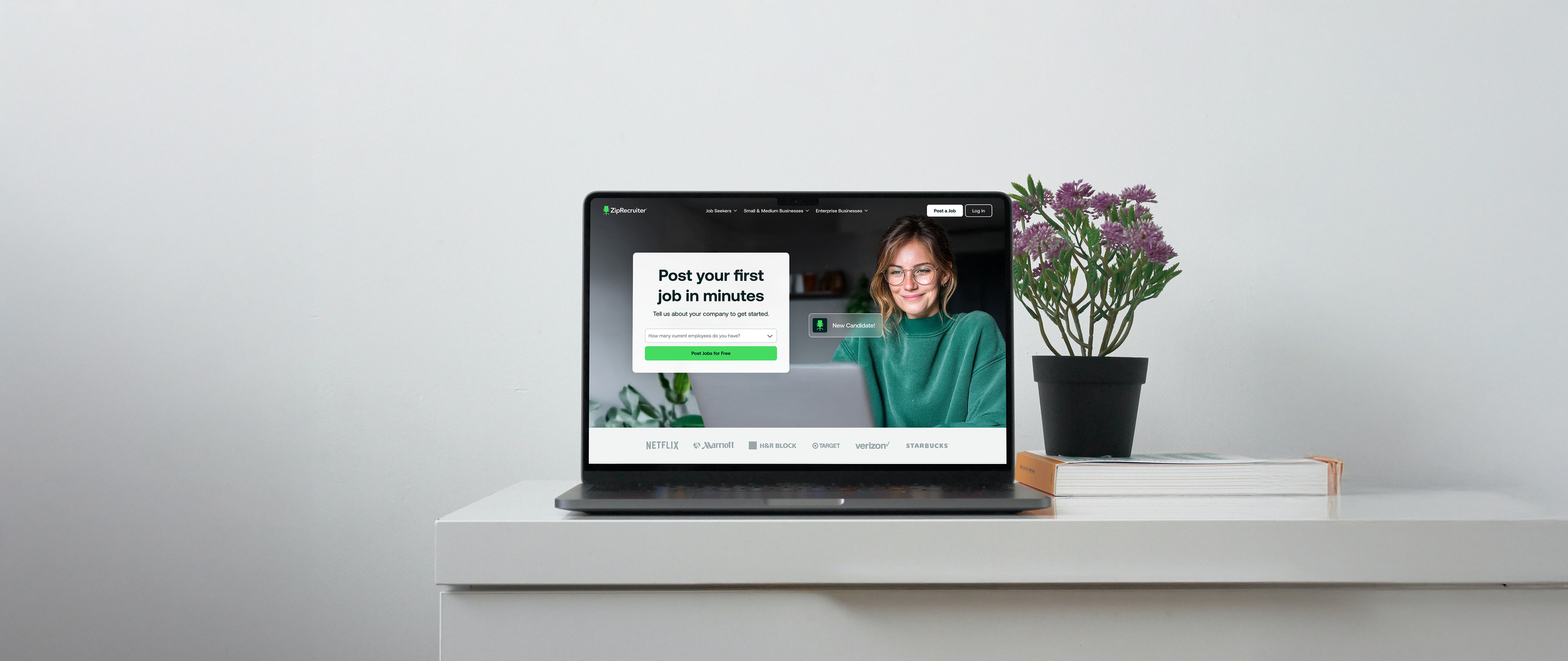
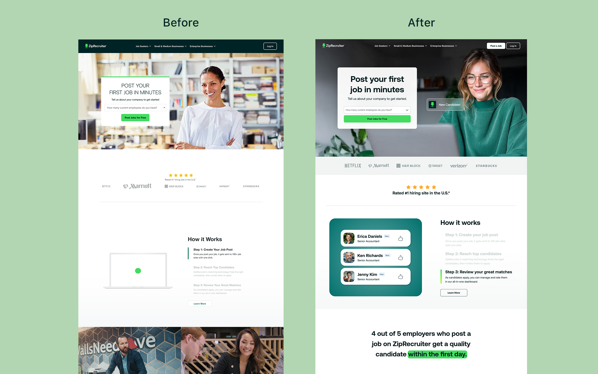
The employer homepage was redesigned to clarify value quickly, surface social proof earlier, and reduce friction to posting a job. Visual hierarchy was simplified, messaging was tightened, and motion was used selectively to guide attention without distraction.
Key focus areas:
Clear primary actions
Faster value communication
Improved trust signals
Motion used to reinforce interaction, not decoration
Animations on the Employer page
Employer page, desktop + mobile
Motion
Short product animations were designed to support onboarding and feature explanation. These explorations focused on pacing, clarity, and alignment with the broader web experience rather than standalone marketing moments.
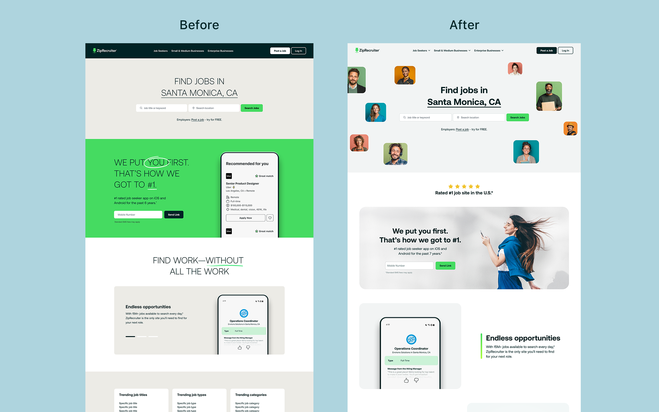
Page 2: Job Seeker Experience
The employer homepage was redesigned to clarify value quickly, surface social proof earlier, and reduce friction to posting a job. Visual hierarchy was simplified, messaging was tightened, and motion was used selectively to guide attention without distraction.
Key focus areas:
Clear primary actions
Faster value communication
Improved trust signals
Motion used to reinforce interaction, not decoration
Project Status
This work was not fully implemented as priorities shifted during a broader brand transition. The concepts informed internal discussions around layout, motion, and content structure and helped shape future direction for the web experience.
This work was not fully implemented as priorities shifted during a broader brand transition. The concepts informed internal discussions around layout, motion, and content structure and helped shape future direction for the web experience.